1. What is Flex?
CSS의 Flex는 Float를 대체할, 아주 강력한 레이아웃을 만드는 기능이다.
여기에서 주의해야 할 점은 cotainer와 item에 적용되는 속성을 구별해서 이해하는 것이다.
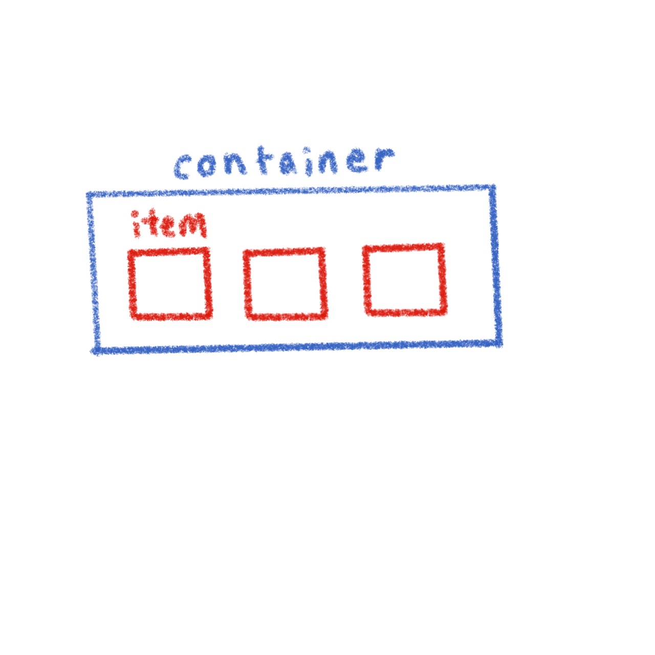
2. container에 적용하는 속성
1️⃣ display : flex
- 가장 먼저 해야 할 일은
container에 해당하는<div>에display:flex;속성을 추가하는 것이다.
- 기본적으로 item 은 inline 속성처럼, 즉 item의 크기만큼 자리를 차지한다.
<!DOCTYPE html>
<html lang="en">
<head>
    <meta charset="UTF-8">
    <meta http-equiv="X-UA-Compatible" content="IE=edge">
    <meta name="viewport" content="width=device-width, initial-scale=1.0">
    <style>
        .container{
            display: flex;
            background-color: dodgerblue;
        }
        .item{
            background-color: tomato;
        }
    </style>
    <title>Document</title>
</head>
<body>
    <div class="container">
        <div class="item">1</div>
        <div class="item">2</div>
        <div class="item">3</div>
    </div>
</body>
</html>
2️⃣ flex-direction
item이 정렬될 축을 설정하는 것
- default : flex-direction:row;
- 반면, flex-direction:column; 을 적용하게 되면 세로축을 기준으로 item이 정렬된다.

flex-direction : column; 을 적용한 것과, 그냥
item을 세로로 배치한 것은 무슨 차이가 있을까?.container에height속성을 주면 그 차이를 알 수 있다.
.container{
            display: flex;
            flex-direction: column;
            background-color: dodgerblue;
            height: 500px;
        }
flex-direction속성에는 row, row-reverse, column, column-reverse가 있다.
3️⃣ flex-wrap
item의 크기가container의 크기를 넘어섰을 때의 처리방법
- default : flex-wrap:nowrap;
nowrap의 경우,item의 크기가container의 크기를 넘어선 경우, 강제로 축소된다.
.container{
            display: flex;
            border : 5px solid dodgerblue;
            flex-wrap: wrap;
            width: 200px;
        }
        .item{
            background-color: tomato;
            width : 100px
        }
.container{
            display: flex;
            border : 5px solid dodgerblue;
            flex-wrap: nowrap;
            width: 200px;
        }
        .item{
            background-color: tomato;
            width : 100px
        }
flex-direction 과 flex-wrap을 한 번에 합쳐서 사용할 수 있다 ⇒ flex-flow

정렬에 있어서 가장 중요한 두가지 키워드는
justify 와 align 이다.
- justify의 t, align의 l을 강조해서 축에 대한 정렬방향을 기억해두자!
- 왼쪽 예시는 flex-direction 즉 axis가 row일 때 기준으로 작성되었다.
4️⃣ justify
- 가장 많이 쓰는 정렬 : justify : center; ⇒ item들을 가운데로 모아준다.
- justify는 축 방향으로! 정렬하는 속성
.container{
            display: flex;
            background-color:  dodgerblue;
            flex-wrap: nowrap;
            /* width: 200px; */
            justify-content: center;
        }
        .item{
            background-color: tomato;
            width : 50px
        }


space-around

space-between

space-evenly
5️⃣ align
- align-items : 기준 축에 수직으로 정렬하는 것.
- align-content :
flex-wrap: wrap;이 설정된 상태에서, 아이템들의 행이 2줄 이상 되었을 때의 수직축 방향 정렬을 결정하는 속성입니다.
- default : flex-items:stretch;

align-items : center

default 상태인 stretch

align-items:flex-start

align-content : center

align-content : space-between

align-content : flex-end
3. items에 적용하는 속성
1️⃣ flex-basis
- flex axis 방향으로의 크기를 나타낸다.
- default : flex-basis:auto; (auto로 설정하면, width 값, width값이 없다면 해당 content의 크기만큼)
- px, em, rem등 익숙한 단위 사용
2️⃣ flex-grow
- default : flex-grow: 0;
- flex-grow를 설정하면, 비율만큼 커진다.
item:nth-child(2) {flex-grow:2}: 2번째item만 2배로 커진다.
3️⃣ flex-shrink
- container가 줄어들 때 고통분담! 해서 줄어드는 정도
- default : flex-shrink:1;
- 만약
flex-shrink : 0;으로 설정하면, container가 아무리 작아져도 쪼그라들지 않고 크기를 유지한다.
flex-grow, flex-shrink, flex-basis 를 한 줄에 축약해서 사용한다.
ex) flex: 1 1 auto
4️⃣ align-self
- container에서 다뤘던 align의 item 버전
- align-self는 align-item보다 우선순위가 있다.
5️⃣ order
- 시각적 순서를 고려한다.
- HTML에서 위치는 그대로 이지만, 시각적으로 보여지는 순서를 바꾸고 싶을 때 사용한다.
Uploaded by N2T